OMHU - An Intentional Grocery Store
Adobe Photoshop | Adobe Illustrator | Watercolor | Adobe InDesign | Package Design

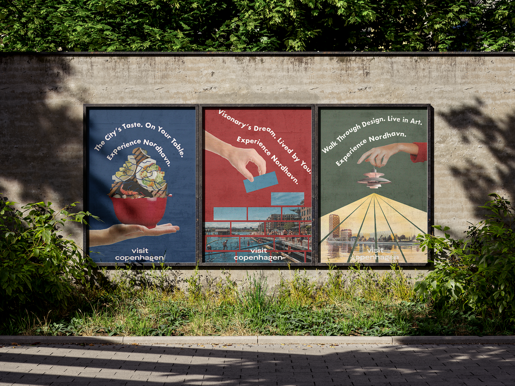
Promotional Flyer
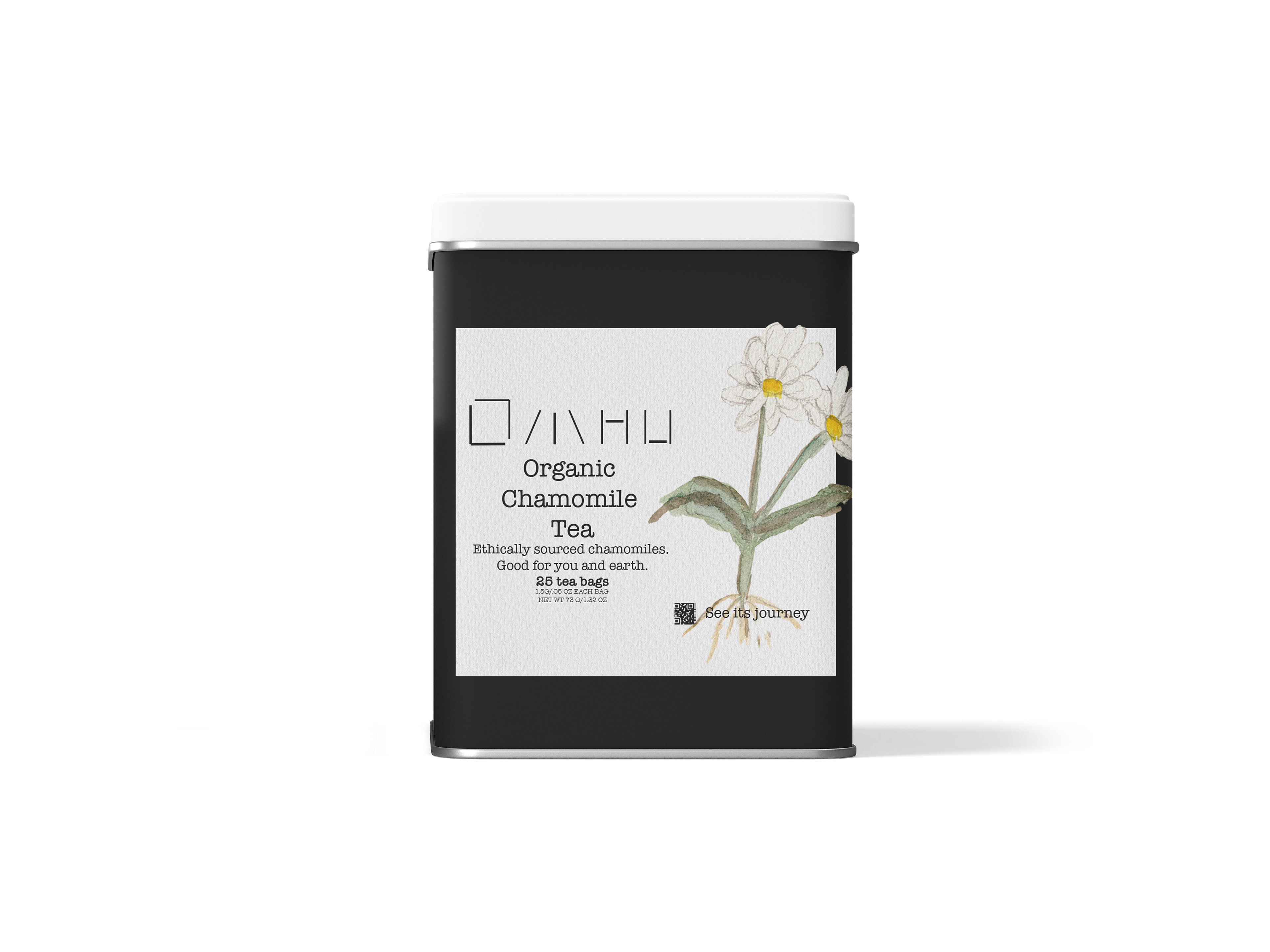
Organic Chamomile Tea

Pure Strawberry Jam
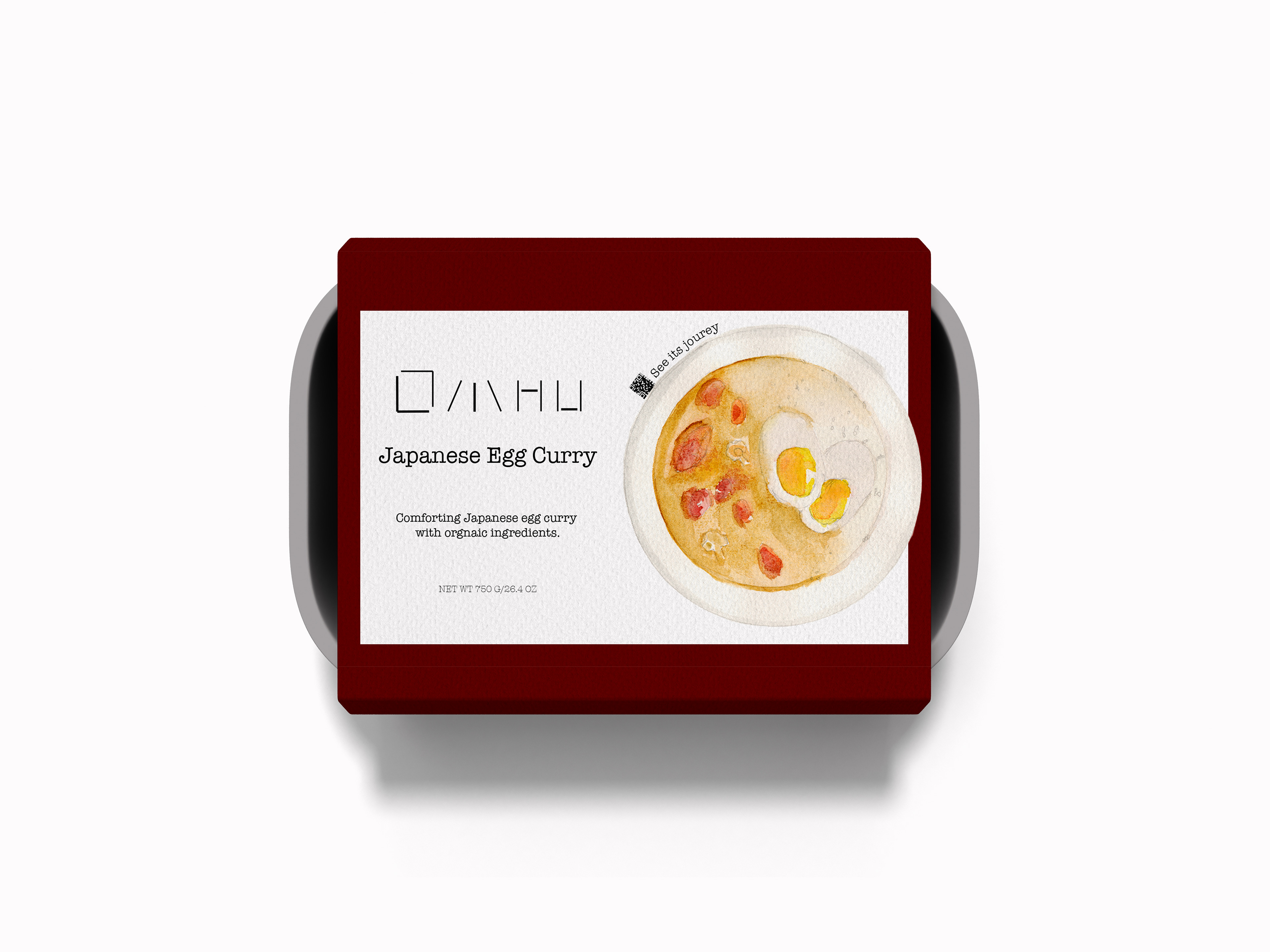
Japanese Egg Curry

Digital Experience

Merchandise 1: Stickers

Receipt Design
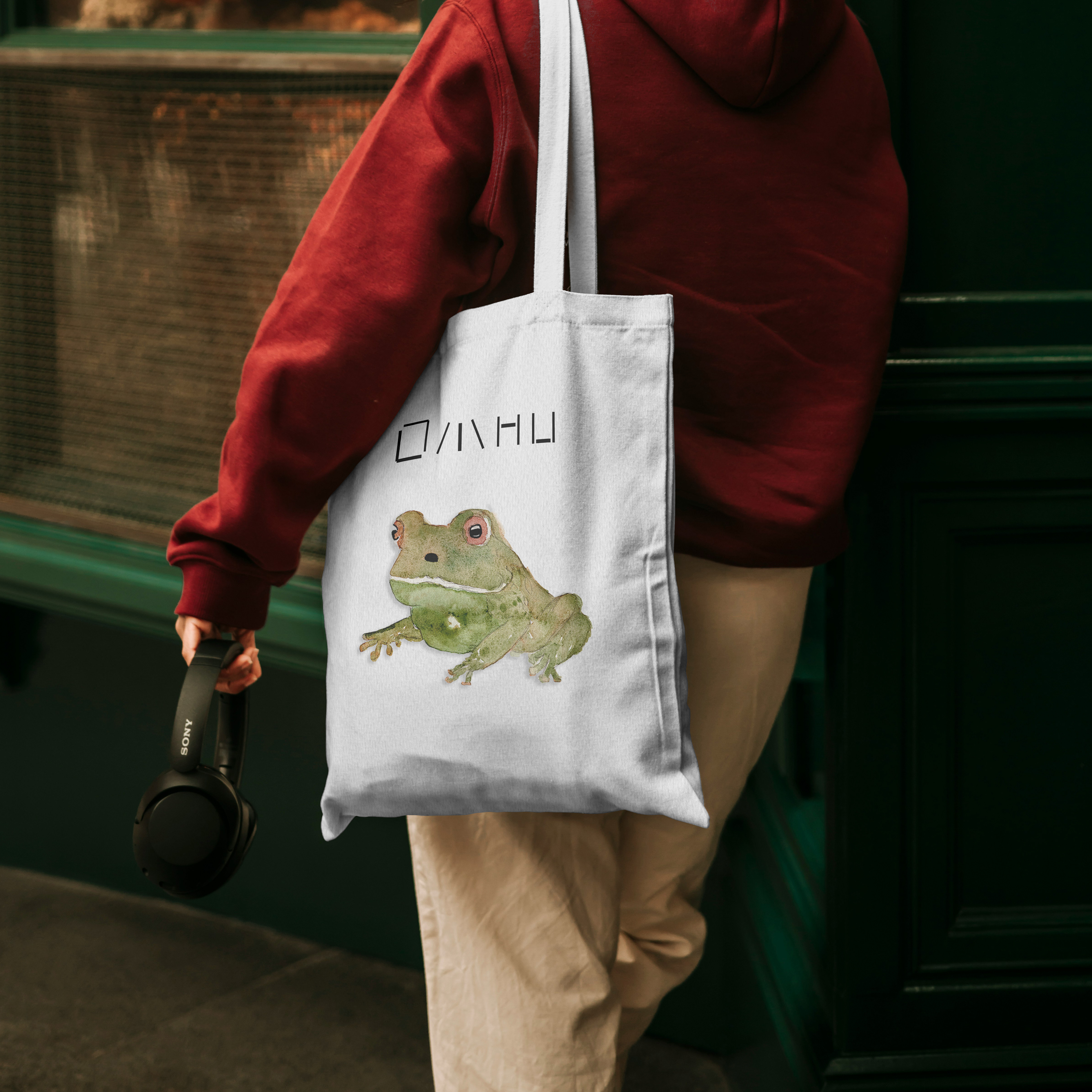
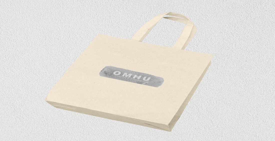
Merchandise 2: Tote Bag
Challenge:
In a world of fast consumption and mindless spending, food waste has become an issue apparent in many forms. From large grocery stores to boutique mom and pop shops, it is difficult to eliminate food waste when consumers focus on frictionless experiences more than they do the quality and ethics of the products.
I hence designed OMHU -- a grocery store that does the hard part for you—a grocery store that hand-picks the products that it sells and how they are produced.
An easy Google search can tell us that "Grocery store food waste in the US is a significant problem, with millions of tons of surplus food ending up in landfills or incinerated annually." A potential solution to this is consumer education. Being able to provide food for consumers that is both ethically sourced and managed.
However, such a grocery store does not exist, so the project requires me to create a visual identity that is completely believable. This then led me to the eight deliverables shown above: promotional flyer, 3 conceptual products, a digital experience, 2 merchandise items, and a receipt.
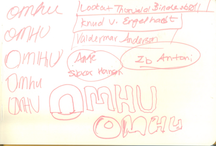
Early Brainstorming and Ideation:
I wanted to make sure that the project stays consistent and coherent throughout the process of development.
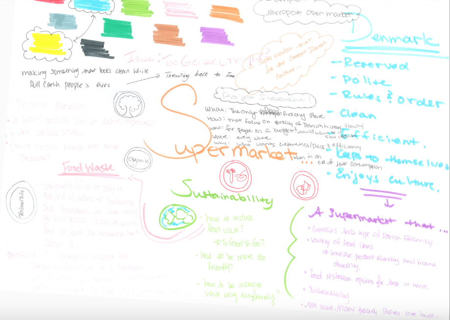
Brain Map
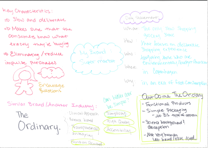
Similar Brands that I want to Mirror

Identity


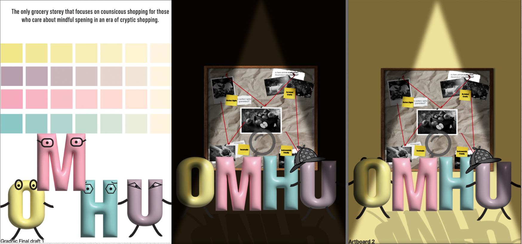


Early Visual Identity Explorations:
Through this project, I tried a bunch of different styles to translate the feeling of deliberateness onto paper. Ultimately, I chose watercolor as a medium.
Logo Exploration:
To translate the idea of transparency and intention, I worked through multiple different versions of the logo.
This logo is inspired by the Japanese brand Muji, which is thoroughly simplistic. However, contrary to Muji's logo, the symbolism behind OMHU is that it encompasses the mountains of nature.


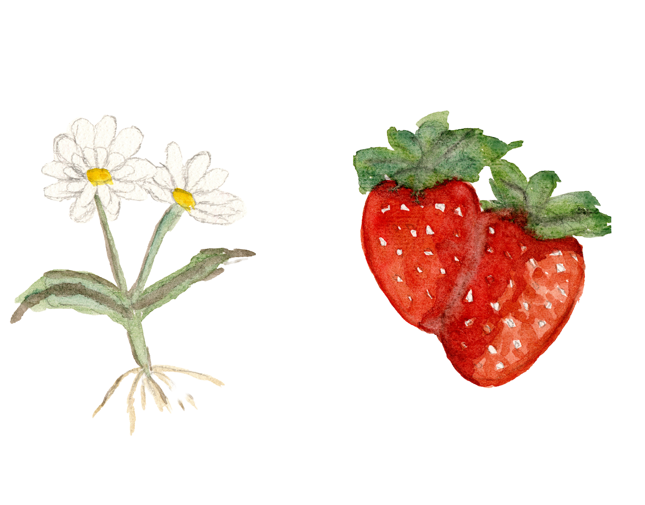
Packaging Exploration:
The packaging designs all started in real life where I hand painted each natural element. I chose three products that could represent OMHU's mission n different fonts. Tea for nature, packaged food for fast consumption turned intentional, and strawberry jam for ethical sourcing.

Jam Iteration 1

Jam Iteration 2
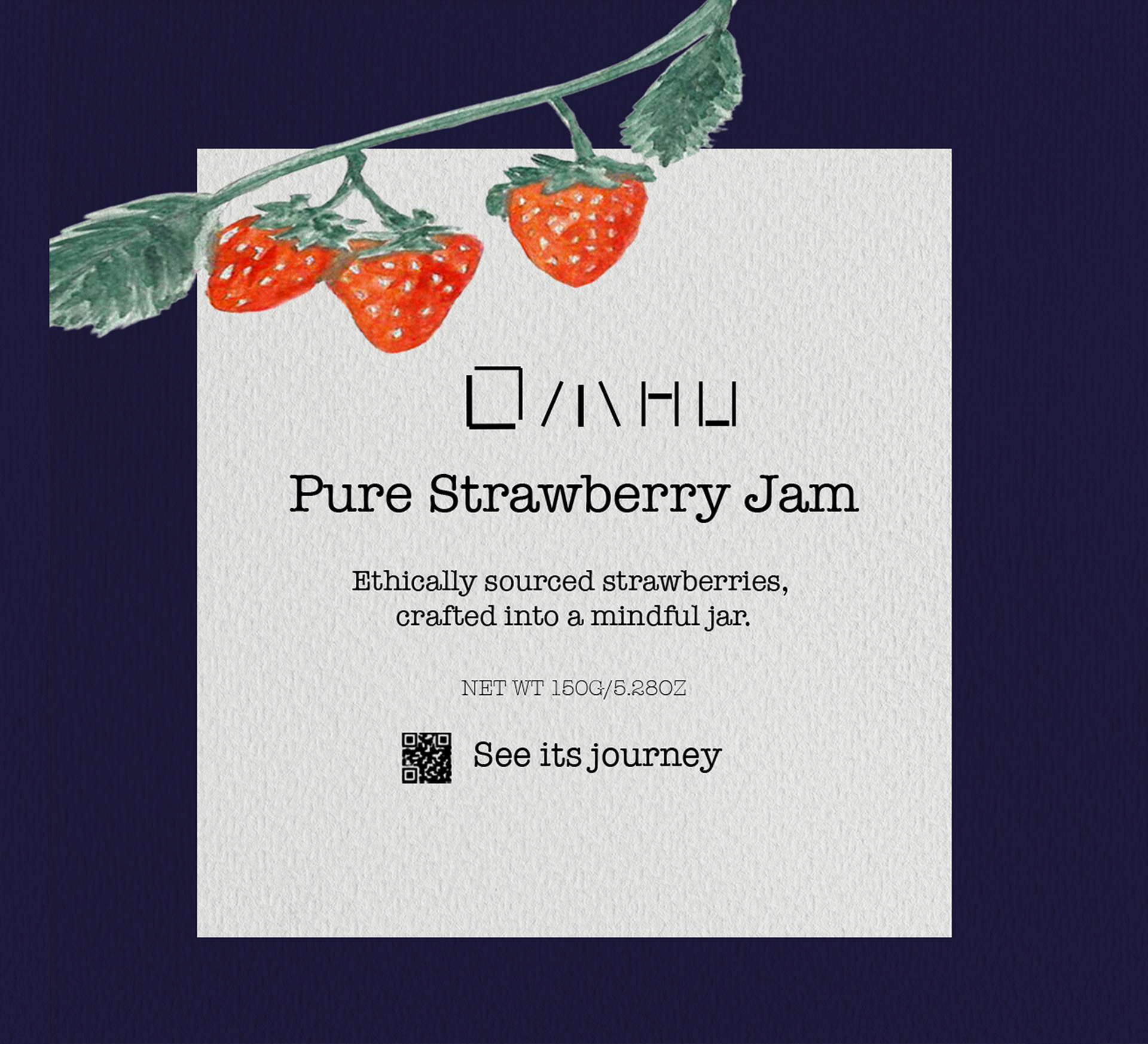
Jam Iteration 3 - Final

Curry Iteration 1
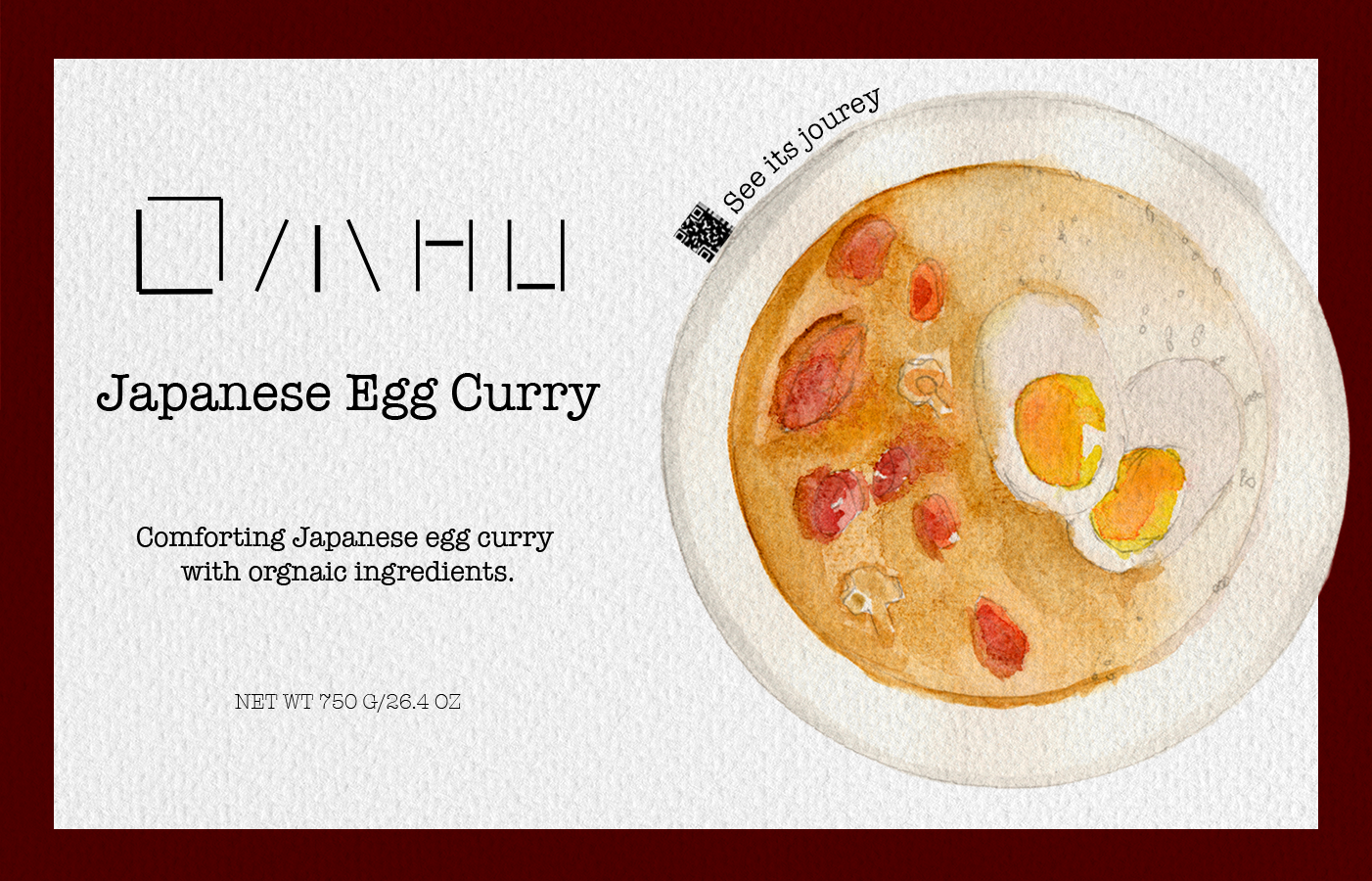
Curry Iteration 2 - Final

Tea Iteration 1
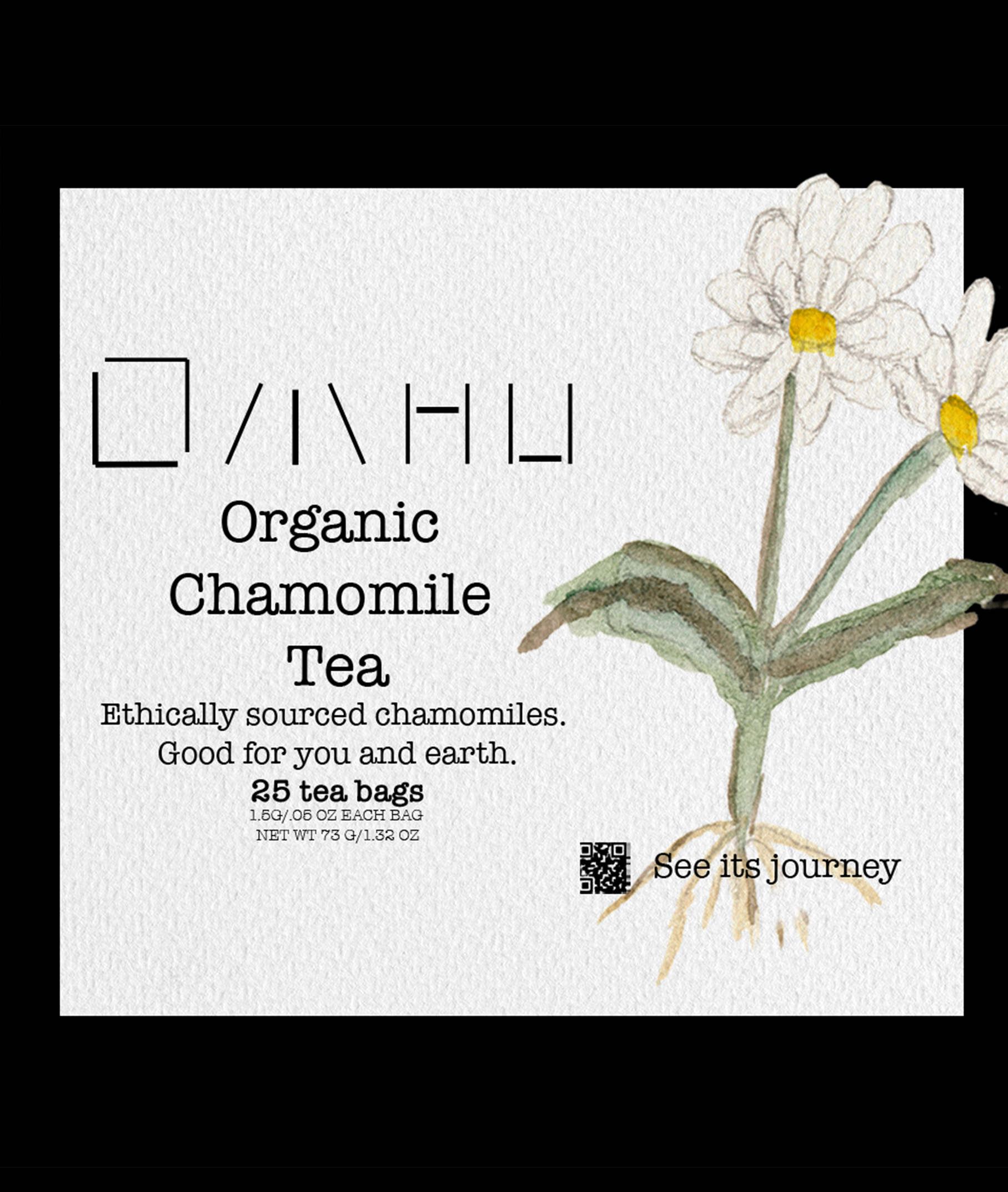
Tea Iteration 2 - Final
Digital Experience Exploration:
In order to communicate transparency and ethical sourcing to the consumers, every packaging contains a QR code that the customers can scan. That QR Code would then take the customer to the journey that product went through to get to their hands.

Digital Experience Iteration 1
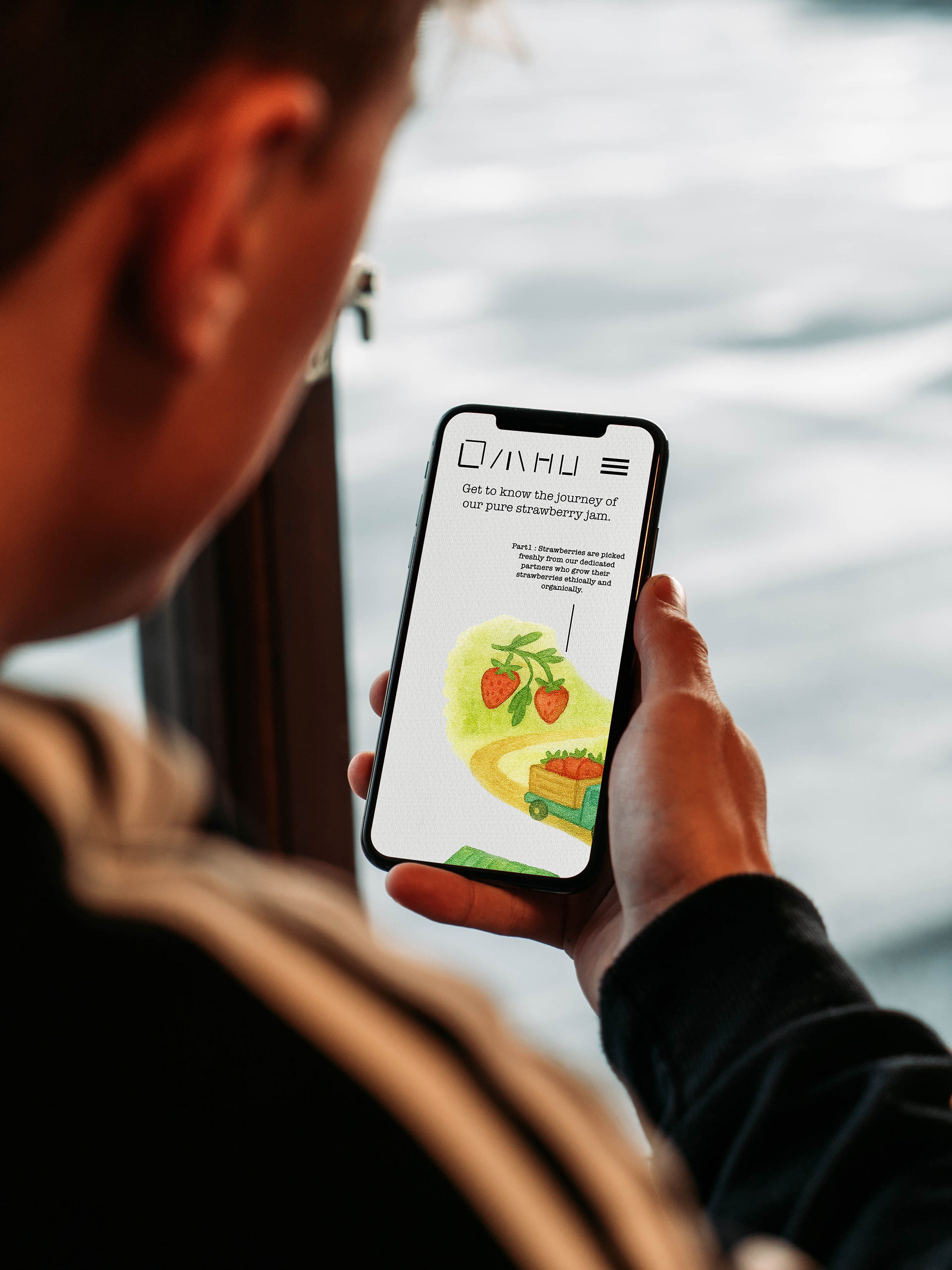
Digital Experience Iteration 2 - Final
Tote Bag Iteration 1

Tote Bag Iteration 2 - Final

Sticker Iteration 1
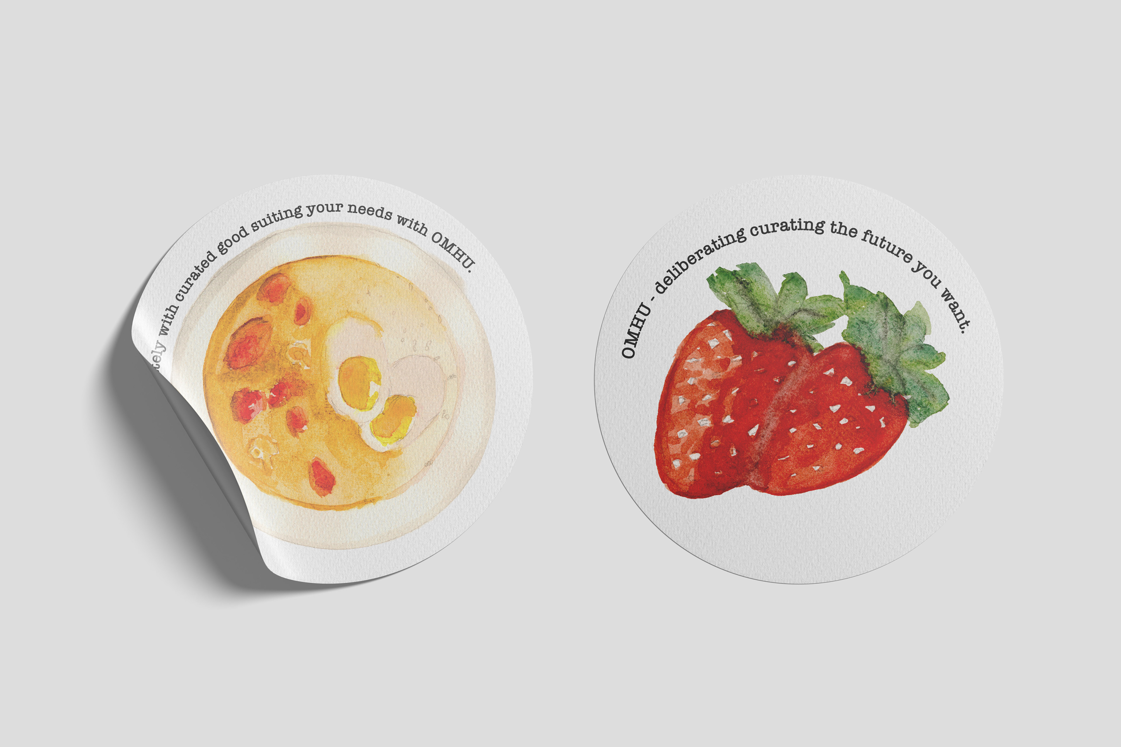
Sticker Iteration 2 - Final
Merchandise Exploration:
I wanted to create items that could translate the visual identity of the brand well and serve as a possible advertisement for OMHU, so I decided to create stickers and tote bags as one is an everyday accessory that has risen in popularity and the other one is versatile and reusable.
Thank you for viewing this project.
If you have any questions or would just like to connect, feel free to contact me any time.